Why Your Prints Don’t Look Like Your Original
You poured hours, weeks, or even months into your artwork.
Every color, shadow, and subtle texture matters. But when your prints arrive, they look… flat, muted, or dull. Your vibrant originals seem to have lost their life. The subtle details you labored over are flattened. Your original had depth. Your print doesn’t.
This isn’t your fault. It’s a translation problem, and it’s more common than most artists realize. Understanding why it happens is the first step to getting prints that truly match your art.
Prints Are Not Screens
Digital files glow. Paper doesn’t. RGB colors that seem electric on a monitor unfortunately cannot exist in ink. Fun fact: this is especially true with reds. High quality inkjet prints have their own wonderful qualities especially when printed on the right paper. But without careful conversion and adjustment, even the most flawless artwork will appear muted on paper.
Commercial (also called offset) printers use metal plates to transfer ink onto paper via rollers each color. It’s a 4-color process where CMYK ink (cyan, magenta, yellow, and black) is separated into plates and your image is printed in layers. This is perfectly adequate and efficient for things like posters, flyers, business cards, and brochures.
Desktop inkjet printers replicate this process using the same CMYK configuration.
Without refined color management though, art can look dull or flat. The fine subtleties in color and texture cannot be fully captured with this 4-color offset printing method, and rarely do all of the colors match the original.
Giclée prints, on the other hand, are made using an 8 to 12-color inkjet printer, which allows double to triple the color combinations of offset printing. Color correction is often done in the proofing process to ensure all the colors are balanced and as true to the original as possible.
At Amazing Art Printing, we use a 12 color archival ink system and acid-free, archival papers to create rich, vibrant, high quality prints that artists can feel proud of.
The Right Paper
The high quality of giclee prints is not only attributed to the ink though. The other half of the equation is paper.
The right paper doesn’t just hold ink - it shapes the way your work is perceived. A subtle watercolor gradient on the wrong paper can disappear. Matte textures can dull highlights. Glossy surfaces can wash out delicate shadows.
The difference between “almost right” and “breathtaking” is a paper that complements your work—not one picked at random.
Let us help you select the right paper for your artwork.
Printer Calibration and Ink Accuracy
High-end printers need precise calibration. Ink density, drying times, and press behavior all affect your final print. Even small shifts can turn a rich red into brown, or a deep blue into gray.
Artists who want vibrant, accurate fine art prints need someone who understands color management, proofing, and high-quality printing techniques - not a machine operator running an automated job.
At Amazing Art Printing, we create custom ICCs and use Photoshop to color correct your prints accurately. Color correction occurs in a process called proofing.
Proofing Is Essential
Every subtle hue, shadow detail, highlight matters. Careful proofing ensures that your prints match your original vision, whether you’re preparing limited edition prints, giclée prints, or exhibition prints. Without a carefully reviewed proof, prints will drift from the original.
Proofing isn’t just a courtesy, It’s your best bet to ensure your vision survives the translation from screen to paper.
We offer proofing and color correcting for every print. Artwork is subject to a $40 proofing fee. We have a knack for metallics, but they are a bitch! Add $35 for originals that contain metallics or glitter.
The Bottom Line: Dull Prints Are Fixable
Dull prints are rarely a reflection of your talent. They are a reflection of the process. Color management, paper selection, file refinement, and proofing are what elevate a print from “flat” to “alive.”
At Amazing Art Printing, we focus on every detail that preserves your original vision, specializing in museum-quality, fine art printing. Because your art deserves more than “good enough.”
Start printing today!
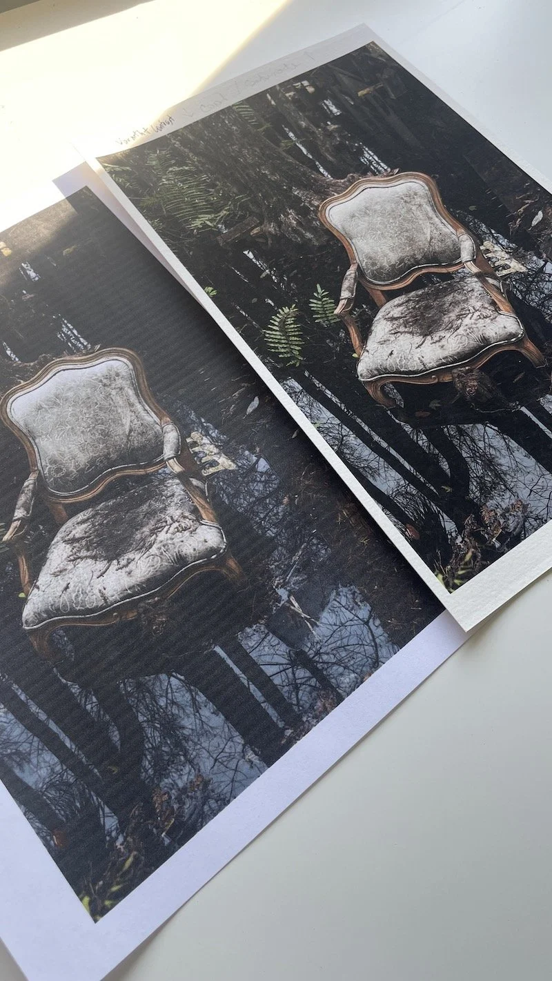
Deskjet print (left) vs. giclée print